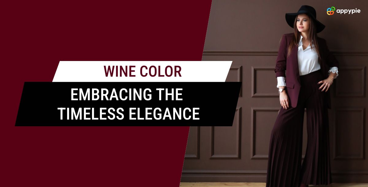

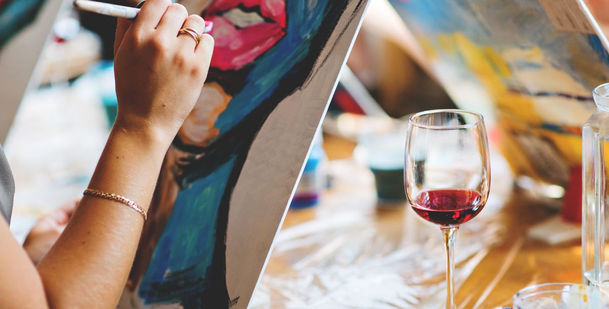
For centuries, the rich and luxurious color of wine has captivated people across cultures. It's a timeless choice for anyone seeking elegance and sophistication, whether in design or fashion.
Wine has long been associated with power, wealth, and prestige. Today, it continues to reign supreme, gracing everything from everyday clothing to the most prestigious runways. Its rich, brownish undertones add undeniable allure to any design element or outfit.
Wondering, you can't achieve this? Even if you're not a core designer, there are AI design tools available to help you experiment with different styles and color combinations featuring wine. Experiment with different styles and color combinations featuring wine. With a little creativity and these handy tools, you can unlock the timeless elegance of wine and incorporate it into your design projects.
History: Tracing the Roots of Wine Color's Allure
The fascination with deep wine color traces back to ancient civilizations, where it was revered for its symbolic significance and aesthetic appeal.
- In ancient Egypt, wine color was associated with royalty and the divine, often adorning the garments of pharaohs and high-ranking officials.
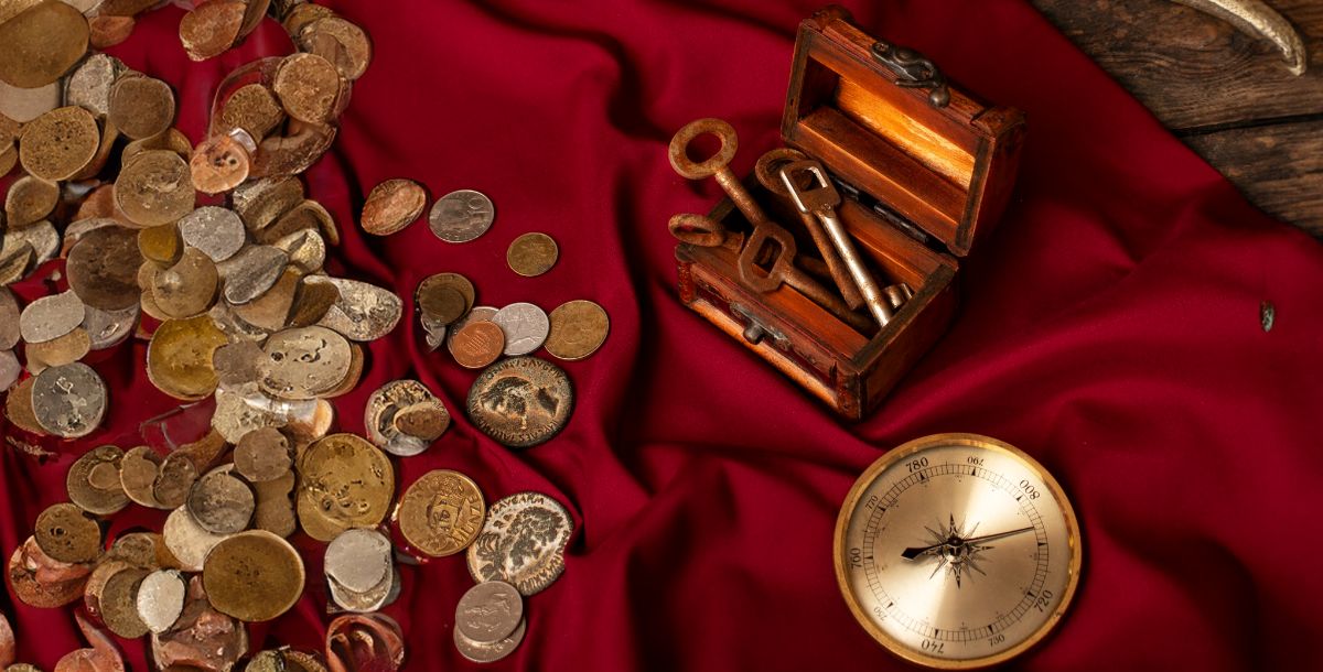
- Similarly, in ancient Rome, the rich crimson hues of wine color were reserved for the elite, symbolizing power, wealth, and social status.
- Throughout the Middle Ages and Renaissance periods, wine color continued to hold sway as a symbol of opulence and refinement.
- European nobility adorned themselves in sumptuous fabrics dyed with rich burgundy and maroon hues, showcasing their wealth and sophistication to the world.
The allure of wine color only grew with time, becoming synonymous with luxury and prestige across the globe.
Unlocking the Palette of Possibilities
Wondering how to choose color palette ? Wine color pairs beautifully with a variety of other hues, enhancing their richness and depth while adding a touch of warmth and sophistication to any outfit or decor scheme.
For a more dramatic look, consider pairing wine color with vibrant jewel tones such as emerald green, sapphire blue, or amethyst purple. These bold, saturated hues create a striking contrast against wine color's deep, muted tones, adding depth and visual interest. Utilizing Best Color Combination strategies can help you achieve the perfect balance between these vibrant shades.
For a more understated and sophisticated shade, opt for neutral shades such as black, white, or gray, which provide a subtle backdrop for wine color to shine. Incorporating Website Color Schemes, a wine-colored dress or blouse paired with black trousers or a white skirt creates a classic and elegant ensemble that is perfect for any occasion.
In addition to clothing and accessories, wine color can also be incorporated into home decor schemes such as paint colors, upholstery fabrics, and accent pieces. Whether you're looking to create a cozy, intimate atmosphere in your living room or add a touch of glamor to your bedroom, wine color can help you achieve the perfect look and feel for your space.
To ensure your decor choices create a cohesive and harmonious space, consider using tools like Appy Pie's color wheel. These tools can help you experiment with different shades of wine and find the perfect pairings for your furniture and existing color scheme.
Why Wine Color is So in Fashion These Days: The Resurgence of a Classic
In today's fashion landscape, wine color has experienced a remarkable resurgence, captivating designers, influencers, and consumers alike.
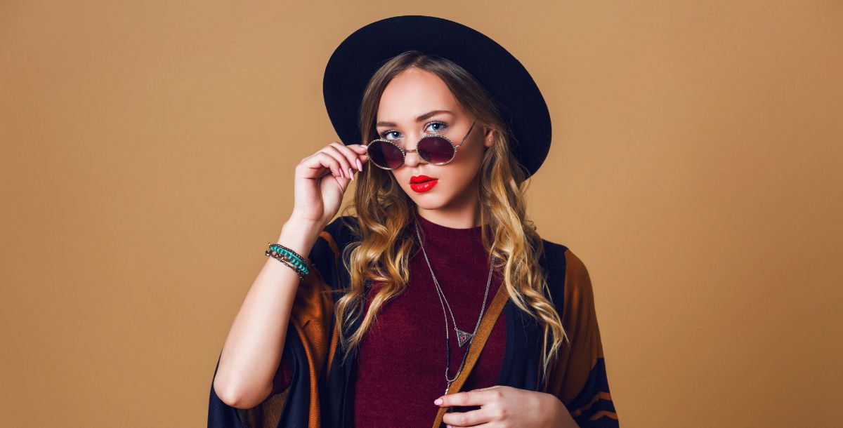
Its timeless appeal, combined with its versatility and ability to flatter a wide range of skin tones, has propelled it back into the spotlight. Fashion enthusiasts are drawn to its deep, brownish wine color undertones, which exude warmth and sophistication, making it a popular choice for both casual and formal wear.
Furthermore, the resurgence of vintage and retro-inspired fashion trends has contributed to wine color's newfound popularity. Designers are incorporating this rich hue into their collections, offering modern interpretations of classic silhouettes and styles. From tailored suits and elegant evening gowns to casual streetwear and accessories, wine color is making its mark across all facets of the fashion industry. Branding in Wine Color
Exploring the Spectrum of Shades
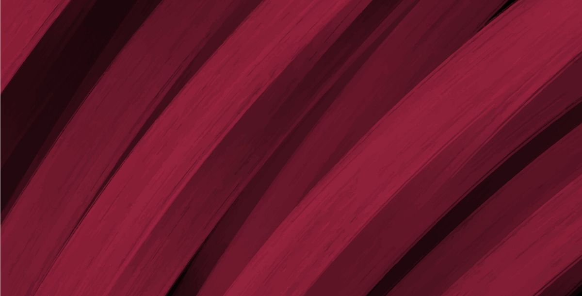
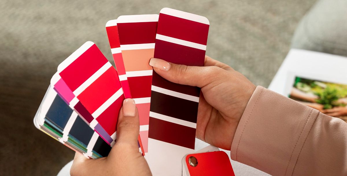
Wine color encompasses a diverse range of hues, from deep, almost black burgundies to vibrant, purple-tinged maroons. Each shade has its own unique characteristics and appeal, offering endless possibilities for creative expression and personal style.
One of the most classic and enduring wine color variations is burgundy, a deep, rich hue reminiscent of aged red wine. Its timeless elegance and versatility make it a popular choice for everything from formal evening wear to casual everyday attire.
Maroon color is a slightly lighter and more vibrant shade, offers a modern twist on the traditional wine color palette, adding a pop of color and personality to any apparel.
In addition to these classic shades, there are also variations such as grape wine color, which features more pronounced purple undertones, and metallic wine color, which incorporates shimmering metallic accents for a touch of glamour and sophistication. Whether you prefer the deep, earthy tones of burgundy or the bold, vibrant hues of grape wine color , there is a shade of wine color to suit every taste and occasion.
Complementary Colors of Wine Color: Unveiling the Perfect Match

Wine color, with its deep and luxurious allure, transcends trends and eras. It's a timeless choice for anyone seeking elegance and sophistication in their designs. Let’s discuss the world of wine color, exploring its captivating shades, conversion methods, and the art of pairing it with complementary hues.
Wine's richness begs for a partner that both complements and enhances its depth. Enter the world of complementary colors! These are hues that sit directly opposite each other on the color wheel, creating a dynamic and visually striking contrast.
Unveiling the Spectrum of Wine Shades
Wine isn't a singular color, but rather a spectrum of rich and captivating hues. From the deep, almost black tones of burgundy to the vibrant, purple-tinged maroons, each shade offers unique depth and personality. Here's a glimpse into the world of wine shades:
Burgundy: A timeless and enduring classic, burgundy's deep, rich hue evokes aged red wine. Its versatility makes it a popular choice for both formal and casual attire.
Maroon: Offering a modern twist, maroon is a slightly lighter and more vibrant shade, adding a pop of personality to any design.
Grape Wine: This shade features pronounced purple undertones, offering a unique dimension to your creations.
Metallic Wine: For a touch of glamour, metallic wine incorporates shimmering accents, adding a touch of sophistication.
Sangria: A bright red with a touch of orange, similar to the popular Spanish drink.
Cranberry: A deeper red with a touch of purple, similar to the color of fresh cranberries.
Exploring Wine Color Hex Codes in Digital Design
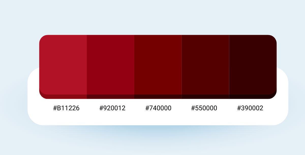
Discover the magic of wine color in digital design with its special hex codes like #5D001E to #990033, giving a deep and luxurious vibe akin to a fine glass of Merlot. You can also find variations like Burgundy and Sangria, offering darker or brighter options. Using wine color in web backgrounds, graphics, and branding adds warmth and sophistication to your projects. Pairing it with colors like gold, olive green, or navy blue creates stunning contrasts that catch the eye. Learning about wine color hex codes opens up endless creative possibilities, making your designs stand out with a touch of elegance and timeless charm.
| Wine Color | Hex Code |
|---|---|
| Merlot | #5D001E |
| Burgundy | #800020 |
| Sangria | #92000A |
| Bordeaux | #99182F |
| Garnet | #8C001A |
Enhance Your Design Skills and Craft Stunning Graphics with Appy Pie’s Image Color Picker
Designing visually appealing graphics can be a daunting task, especially if you’re not familiar with color theory. However, with Appy Pie’s Image Color Picker, enhancing your design skills and creating gorgeous graphics has never been easier. Here’s a step-by-step guide to create stunning graphics:
- Choose an Image: Either choose an image from your computer or enter an image URL, and the image will be uploaded to the screen.
- Pick a Color: You can now pick any color on this image using your mouse pointer.
- Analyze Color Codes: Once you choose the color, you will have HEX, RGB, HSL, and CMYK codes for the color displayed on your screen.
- Preview Your Color Palette: As you scroll down, you will also get an entire palette curated for you directly from the image!
- Save and Export Your Design: Finally, save your color palette and use it in your design. Appy Pie’s Image Color Picker tool allows you to export your color palette as a PNG or SVG file, making it easy to use in your design software of choice.
By following these simple steps, you can create a visually appealing color palette that will take your designs to the next level.
Conclusion
Whether you're drawn to the deep, earthy tones of burgundy or the vibrant pops of grape wine, there's a shade of wine waiting to unleash your inner fashionista (or interior decorator!).
And the best part? You don't need to be a design pro to rock this regal color. With a little creativity and the help of our tools, you can experiment with different shades and combinations to create a look that's uniquely you. So, go forth, embrace the allure of wine color, and add a touch of timeless elegance to your world!
Related Articles
- 10 Effective Ways to Get More Private Tutoring Clients in 2024
- The Gmail Shortcuts You Should Actually Be Using to Navigate Your Inbox
- What is GPT? Everything You Need to Know
- Key Ad Design Tips to Help Your Brand Make Good Advertisements
- What is a CRM Workflow? Benefits of CRM Workflow for Your Business Growth
- 30 Best & Worst Resume Fonts for Job Seekers in 2024
- Images that Sound: Composing Images and Sounds on a Single Canvas
- Enhancing Customer Value: The Key to Business Success
- Hex Colors: Trends, Techniques & How do Hex Code colors work
- 10 Simple Ways To Grow Customer Base
Most Popular Posts
- Holi Festival of Colors: A Colorful Journey Through History, Legends, and Celebrations
- What is Leadership? – 10 Great Tips to become a better leader
- Best Document Apps for Android & iPhone [2024 Edition]
- How to Speed Up LLM Training with Distributed Systems?
- SciFIBench: Benchmarking Large Multimodal Models for Scientific Figure Interpretation